
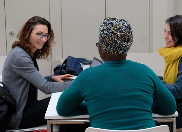
Our team
Our team bring together a unique combination of expertise, skills and drive to meet our ambition of making cities healthier places for everyone to live in.
Read more
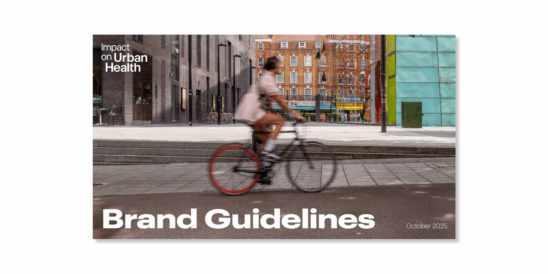
These guidelines are here to help you use, and bring to life, the Impact on Urban Health brand.
This page pulls out key elements of our brand, but full guidance on how to use our brand is in the brand guidelines document.
All use of our brand is subject to sign-off from Impact on Urban Health. Please liaise with your contact at the organisation to get branded materials approved if you’re one of our partners.
Contact our communications team if you have any questions on how to use our guidelines: communications@urbanhealth.org.uk.
Talk about our brand using our boilerplate:
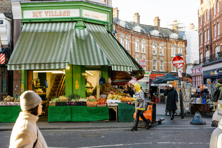
The places that we grow up, live and work impact how healthy we are. Urban areas, like inner-city London, have some of the most extreme health outcomes. Alongside their vibrancy and diversity sit stark health inequalities.
At Impact on Urban Health, we want to change this. We believe that we can remove obstacles to good health, by making urban areas healthier places for everyone to live.
The London Boroughs of Lambeth and Southwark are our home. They are some of the most diverse areas in the world. It is here that we invest, test, and build our understanding of how cities can be shaped to support better health. We’re focused on a few complex health issues that disproportionately impact people living in cities, and we work with local, national and international organisations, groups and individuals to tackle these.
Our place is like so many others. So we share our insight, evidence and practical learning to improve health in cities around the world.
Impact on Urban Health is a part of Guy’s & St Thomas’ Foundation.
Our primary logo is a black wordmark on a white background. This is the main way our brand should be presented.
In circumstances where the black text will not pass accessibility, for example a dark report cover, use the white wordmark instead.
When talking about the organisation, you should write our name as it is in our logo: Impact on Urban Health.
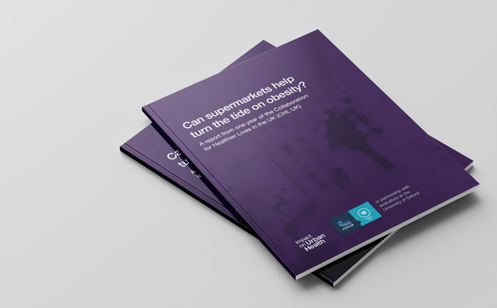
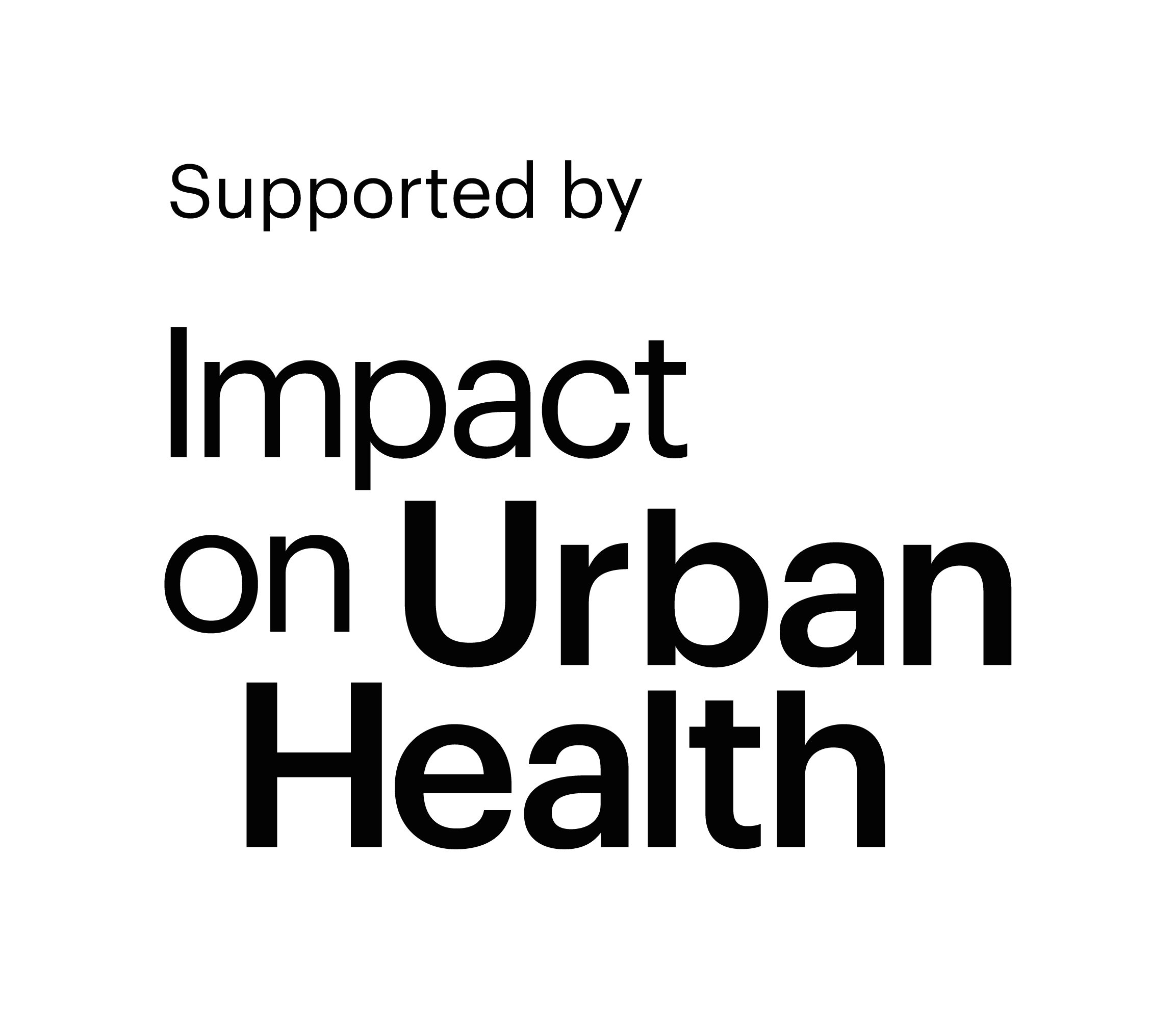
Where Impact on Urban Health plays a supporting role in a project or activity, partners can use alternative logos which say ‘supported by’ and ‘in partnership with’.
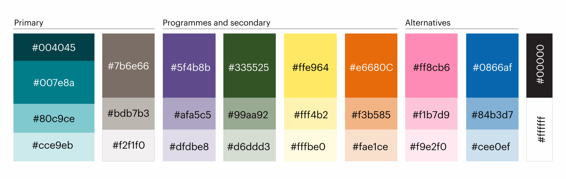
The brand colour palette shown here, as well as black and white, should be all you need.
Black and white are the predominant choice for text and headings. For ease, follow the text colour used on each colour in the palette below.
Our programme-specific colours are used when designing content for each of these areas of work and can also be used as accents on other outputs. See our brand guidelines for full details on how to use programme specific colours.
Our primary font is Graphik. Use this for all communications, internal and external, where possible.
However, if Graphik is unavailable, you can use Aptos. Aptos is a Microsoft font and is free to download.
Our team bring together a unique combination of expertise, skills and drive to meet our ambition of making cities healthier places for everyone to live in.
Our work
We believe we can improve global health by focusing on cities.
We want to hear from anyone who can help us improve urban health.