Urban Health Index 2025
Explore the Urban Health Index, which looks at the social and environmental factors that shape the health of people living in Lambeth and Southwark.
Read more
Data
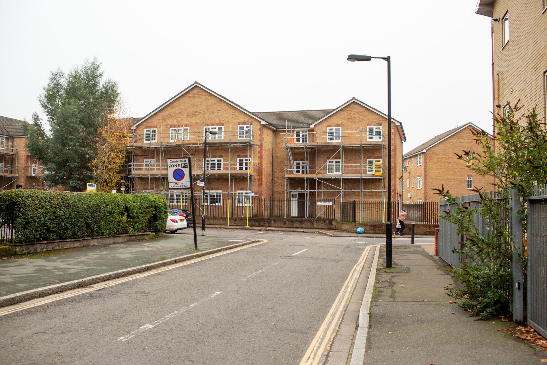
Some neighbourhoods in Lambeth and Southwark sit close to opportunities on the map but remain cut off from them - shaped by overlapping pressures in people's daily lives. The 2025 Urban Health Index reveals this overlooked pattern, and what it means for the people living it.
Opportunities to live in good health are not shared evenly across cities. Even nearby wards can offer very different chances of living a healthy life. This reflects differences in housing, environment, income, safety, and access to opportunity.
The 2025 Urban Health Index (UHI) for Lambeth and Southwark shows a clear pattern: areas just outside each borough’s centre score worse than both central and outer neighbourhoods. Many of these wards are in Transport for London’s zone 2: close to economic opportunities on the map, but with residents experiencing pressures in their daily life.
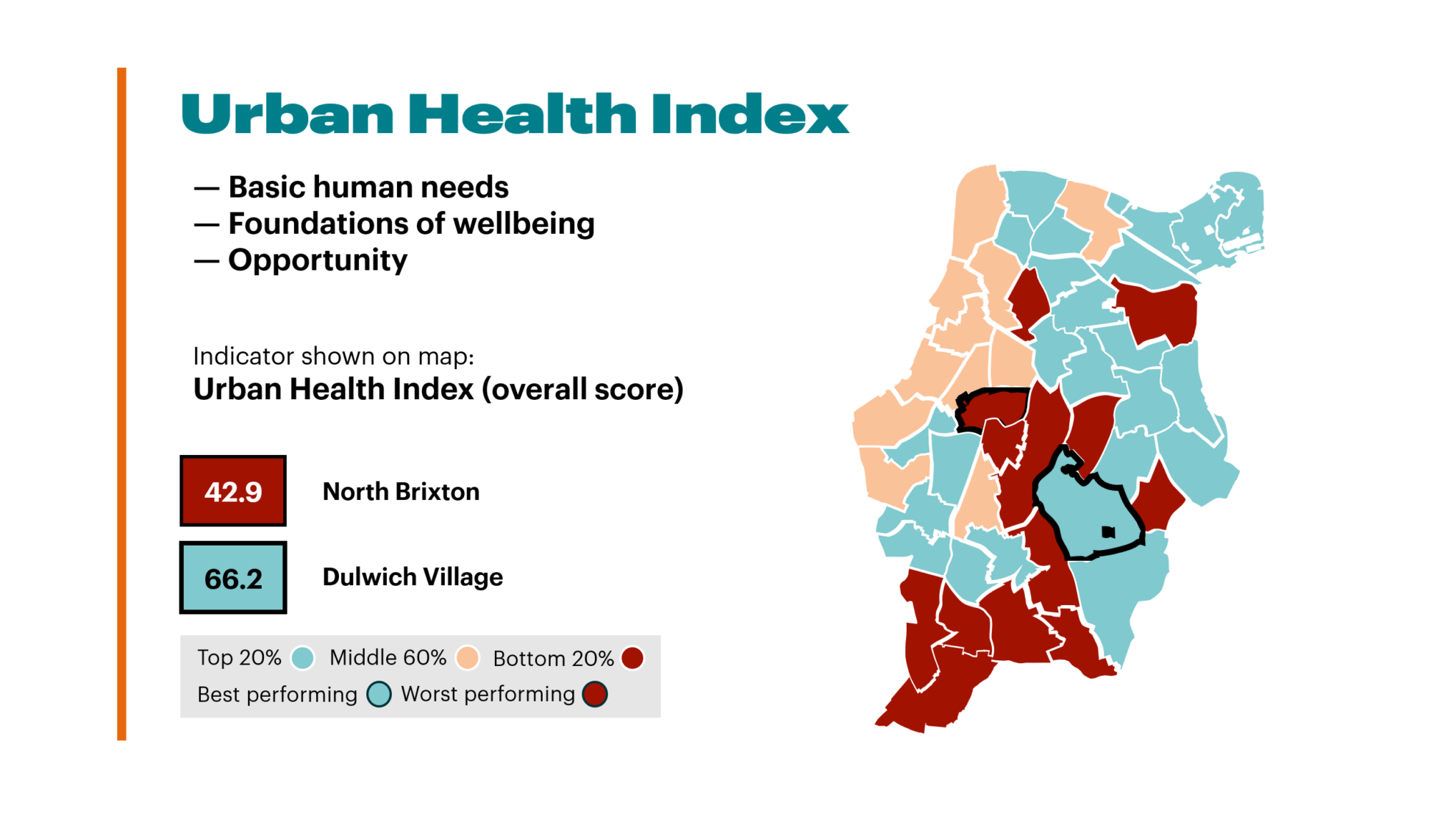
The Urban Health Index (UHI) is a tool that helps us understand the social and environmental conditions that shape health across the London boroughs of Lambeth and Southwark. It brings together 54 indicators across three dimensions – Basic Human Needs, Foundations of Wellbeing, and Opportunity – to produce an overall score for each ward.
We recently explored how these indicators relate to people’s social, economic, and health experiences – focussing on where multiple pressures co-exist in people’s lives.
When looking at the map of Lambeth and Southwark in the UHI, there’s a clear pattern that shows the lowest scoring areas in a visible band just outside the centre of the boroughs.
Figure 1: Overall UHI score for all Lambeth and Southwark wards. Scores are out of 0-100, where 100 is the most desirable outcome and 0 is the least desirable.
This reflects two familiar patterns at either end. Central wards often perform well on measures that consider access to transport, education, digital connectivity and healthcare, while they are often marked lower for measures that look at people’s environments – such as air quality and the amount of green space in their neighbourhoods.
Further out, some neighbourhoods benefit from safer streets and greener surroundings but face challenges in access to public transport, digital inclusion or distance from essential services.
Between these sits a group of neighbourhoods that perform poorly across multiple dimensions. They do not benefit fully from opportunities close to central London and the City – yet also miss out on some of the green spaces seen further out. This recurring pattern is what we describe as neighbourhoods caught in the middle.
Figure 2: The ten lowest-scoring wards that make up this inner-adjacent band.
What distinguishes these neighbourhoods is not one issue but different everyday pressures adding up.
One of the most consistent drivers of low scores is housing. Across almost all of these wards, the scores linked to overcrowded homes and people relying on benefits to pay their rent sits in the bottom quarter of all wards in Lambeth and Southwark. This tells us that these households are struggling to access appropriate homes – with limited space, insecurity and fewer options to move locally.
In these neighbourhoods, residents experience higher crime rates and poorer health and wellbeing – demonstrating how people’s environments can create additional pressures on their lives.
Many of these wards score poorly on access to advanced education, driven by lower rates of adults with higher-level qualifications and higher rates of people with no formal qualifications. This limits people’s longer-term opportunities, even in places that are geographically close to jobs, universities and places to access training.
Together, these pressures help explain why being close to opportunities does not automatically mean people have access to them.
Common pressures
Areas of relative strength
Lower UHI scores don’t just tell us about the opportunities that do not exist in a ward. Even among the lowest-scoring wards, there are areas of relative strength that point to resilience despite sustained pressures.
Across these neighbourhoods, several wards perform better on environmental quality and on some factors linked to personal freedom and choice. They often have high levels of walking and cycling – everyday behaviours that support people’s health and reflect active, lived-in communities.
Whilst some neighbourhoods lack strong systems for inclusion and rights, in some cases there are better opportunities to access education – with increased access to apprenticeships or fairer qualification results.
Understanding how factors ladder up is essential when making policy and funding decisions. The UHI helps identify areas where multiple pressures such as housing, safety, health, and opportunity come together even when no single problem stands out.
Most importantly, this shows the value of looking at places in a more rounded way, rather than relying on labels or single measures. The UHI does not replace local knowledge or lived experience. Instead, it offers shared evidence to help ask better questions about where pressures are growing, where resilience remains and where support may be missing.
Explore the Urban Health Index to dive deeper into these insights.
Data
Explore the Urban Health Index, which looks at the social and environmental factors that shape the health of people living in Lambeth and Southwark.
Data

How the Urban Health Index can help users better understand the social and environmental factors that shape people’s health and wellbeing.
Data

Four years ago, we launched our first Urban Health Index. In this blog, we take a closer look at the updated Index – and what it tells us about health inequality within Lambeth and Southwark.