
Urban Health Index 2025
Explore the Urban Health Index, which looks at the social and environmental factors that shape the health of people living in Lambeth and Southwark.
Read more

Data
Four years ago, we launched our first Urban Health Index. In this blog, we take a closer look at the updated Index – and what it tells us about health inequality within Lambeth and Southwark.

We’ve re-launched the Urban Health Index (UHI) – a ground-breaking social progress index for the London boroughs of Lambeth and Southwark. The latest version is designed to be more accessible, holds additional data to contextualise ward-level information and has been produced with greater collaboration with our stakeholders. It has been developed in partnership with Impera Analytics.
The latest version of the UHI provides a detailed, local picture of the high levels of inequality between neighbourhoods. For instance, it shows us that the life expectancy gap between two wards in Lambeth and Southwark can be as much as 12.6 years for men and 10.7 years for women.
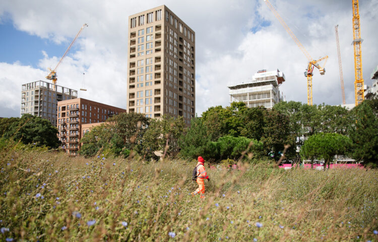
Where you live shapes your health. In urban areas, overlapping inequalities — in housing, income, safety, and access to services — can make it much harder to live a healthy life. Having a detailed understanding of how neighbourhoods look and feel for their residents can help us inform plans to drive lasting change.
The UHI calculates an overall score for wards out of 100 based on 54 indicators that measure social outcomes. The closer to 100 a ward is scored the healthier it is. Of the 48 wards across Lambeth and Southwark, Dulwich Village ranks highest with a score of 66, while Brixton North – just a 30-minute walk away – scores 43.
These differences aren’t just statistical – they reflect radically different lives. A child growing up in Brixton North is three times more likely to be obese by Year 6 and more than four times more likely to live in an overcrowded home than a child growing up in Dulwich Village.
With users now able to explore the latest ward data through multiple dashboards, the new UHI offers a more flexible and detailed experience than previous versions. It includes:
We worked closely with Lambeth and Southwark borough councils and across our teams to make the tools as useful as possible to them. One of the ways we’ve done this is by including the latest data on homelessness, as well as giving the option for users to view the data in ways that tell a more complete story – instead of just scorecards.
Over the coming months we’ll be exploring the data the updated UHI shows us in more depth, taking deep dives into specific topics and turning insights into practical steps to help users act on the social and economic determinants of health in our boroughs.
The UHI isn’t just a tool but should be a springboard for action. You can start by exploring the dashboard, looking at data specific to a ward you work (or live) in, and reflect on the ways the data might shape the way you approach your work.
Data
Explore the Urban Health Index, which looks at the social and environmental factors that shape the health of people living in Lambeth and Southwark.
Data

Read more about the renewed Urban Health Index, how you might use it, and what the data tells us about health in Lambeth and Southwark.