Urban Health Index (UHI) for Lambeth and Southwark 2023
With the Social Progress Imperative, we've developed the first neighbourhood level, health-focused social progress index of its kind.
Read more

Urban health
Three months on from launching our urban health index in Lambeth and Southwark, our Data Partnerships Manager Anna Tarkington shares how we've continued to develop the index.

Two months ago, we launched the Urban Health Index (UHI) – a comprehensive picture of Lambeth and Southwark. This was modelled on the Social Progress Imperative’s Social Progress Index. Since then, we’ve been encouraged by the conversations we’ve had with organisations and local government who see real value in the tool and what it can bring. The primary interface is an easy-to-navigate scorecard for each of our 68 neighbourhoods (MSOAs) that make up these two South London boroughs.
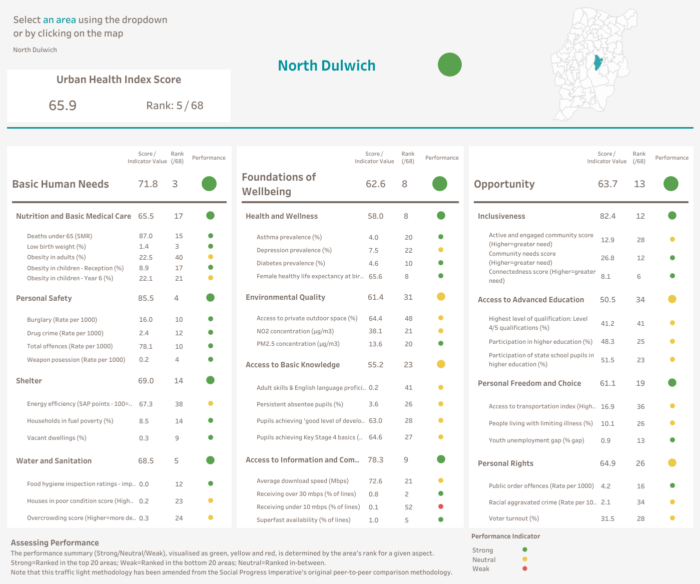
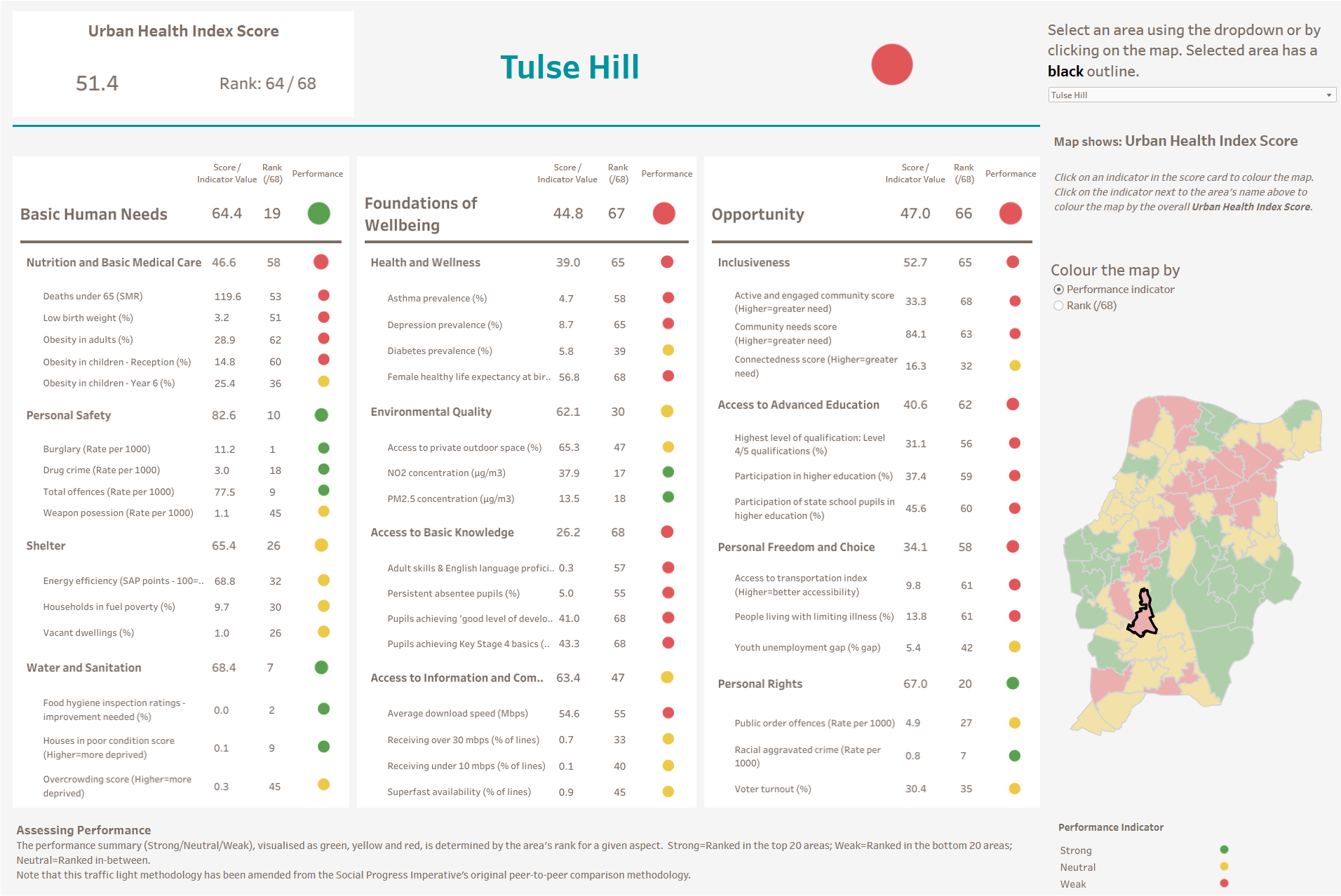
Over the past few months, we have been busy taking the UHI to the next level. We have now added the underlying data and added a map of our boroughs to the scorecard. This view quickly and clearly demonstrates the layout of the UHI scores across the different areas. You can drill down to Dimension, Component, or even Indicator level to see how they each perform across the boroughs. This functionality makes it much easier to get a sense of the spread of scores and identify areas where we might want to explore further.
A screenshot from the Urban Health Index (UHI)
We’ve also begun to explore the UHI in more depth to better understand what the data is telling us. While we are acutely aware that income is a major driver of health, we were particularly interested in exploring which neighbourhoods in the borough were economically similar but have different UHI Health & Wellness scores. This would allow us to think about what actions and targeted interventions could potentially improve health outcomes.
To investigate this, we developed a visualisation of all the neighbourhoods. These were colour coded as per their red, yellow and green Health and Wellness performance score. We then organised them by median household income.
We identified Nunhead South and Newlands, and Borough and Southwark Street as MSOAs with very similar average household incomes, but vastly different Health & Wellness scores. While one ranked 2nd out of the 68 MSOAs, the other ranked 67th. Despite having a similar economic profile, these two neighbourhoods have very different scorecards.
Borough and Southwark Street overall score quite low, but has one of the best Health and Wellness scores of both boroughs. Conversely, Nunhead South and Newlands have a much better overall score, but ranked second to last in Health & Wellness. We wanted to understand what other indicators scored similarly and could be impacting those neighbourhoods health.
Upon further exploration of the scorecard, we see that Inclusiveness looks very similar to the Health and Wellness score, in particular the Active and Engaged community score. Nunhead South and Newlands has nearly the worst health outcome and also appears to have much greater community needs, experiencing lower levels of third sector civic and community activity and barriers to participation and engagement.


Borough and Southwark Street scores extremely well in Health & Wellness. Similarly, it scores really well in the Active and Engaged community indicator. Our financial foundations for adult health programme, focuses on neighbourhoods, the importance of having a strong sense of close-knit community, and the detriment of social isolation. Therefore, the findings we see here exemplifies how impactful social inclusion may be on the health of our communities and is an outcome that we can begin to address.
The neighbourhood schemes, part of our financial foundation for adult health programme, provide spaces where people can meet, build healthy relationships and form a community. The UHI showcases the importance of this. It can help identify areas where these projects can have a real impact in tackling the social inequalities that affect health and wellbeing in our place.
The Urban Health Index has been designed and developed for everyone to use and benefit from. We are continuously working with partners and stakeholders to make this tool accessible and useful for all. If you would like to learn more about the Urban Health Index, or provide feedback, please do get in touch.
What being a data-led organisation means to us and how we use data to guide our funding and strategic decisions.
Data Partnerships Manager, Anna Tarkington, talks about the launch of the Urban Health Index, a ground-breaking social progress index for Lambeth and Southwark.
In Toronto, we learned how data and technology can be used to identify and build an accurate picture of health issues.