Urban Health Index (UHI) for Lambeth and Southwark 2023
With the Social Progress Imperative, we've developed the first neighbourhood level, health-focused social progress index of its kind.
Read more
Data
Two years ago, we launched our first Urban Health Index (UHI). We have now updated our index, the data, measurements and the look and feel.

This blog post is about the 2023 version of the Urban Health Index. View the latest version of the Urban Health Index, launched in 2025.
At Impact on Urban Health, we explore new innovative ideas that can help us get closer to achieving health equity.
Two years ago, we launched our first Urban Health Index (UHI). This brought together a set of metrics that helped us understand the social and environmental factors that shape the health and wellbeing of the population living in Lambeth and Southwark.
The UHI can help us understand the needs of neighbourhoods in Lambeth and Southwark, and where our projects can make a greater impact.
We have now updated our index and in the process, implemented changes following consultation with key stakeholders:
To update the UHI, we reviewed the underlying indicators:.
These changes, in particular the addition of newly available indicators, strengthen the Index overall. However, this means the updated UHI is not directly comparable to the earlier version.
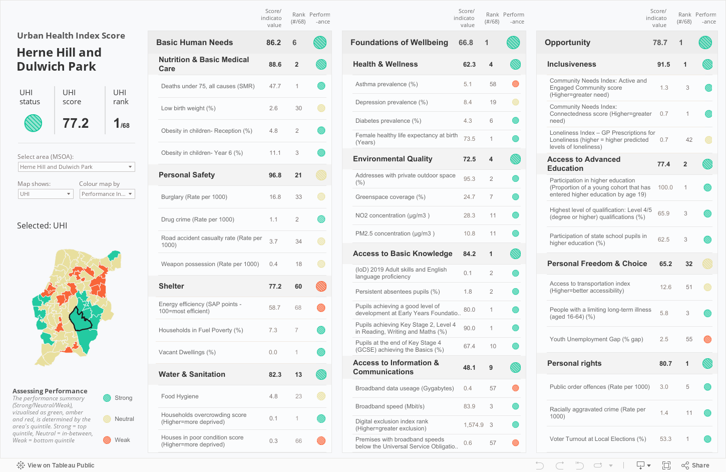
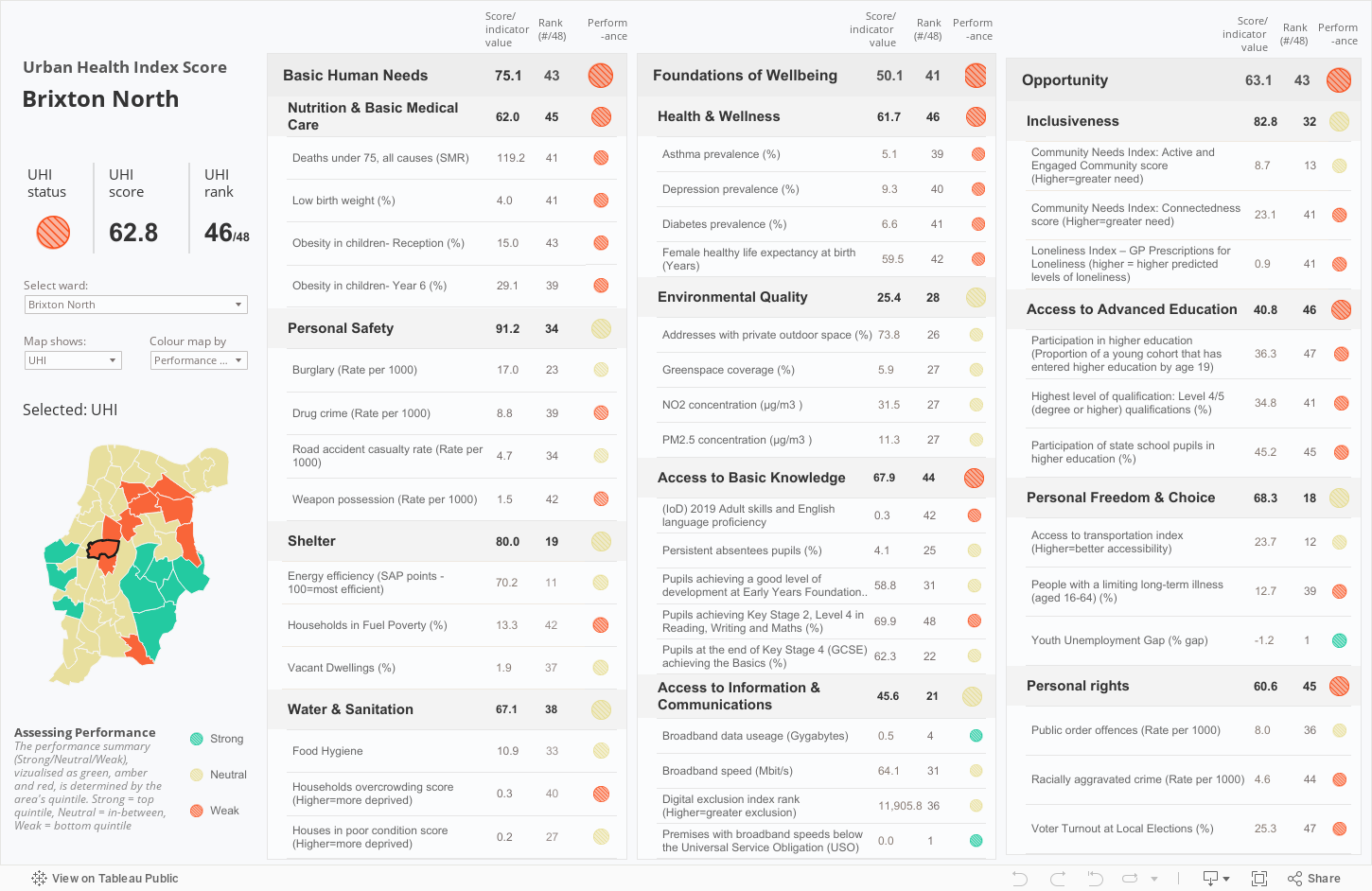
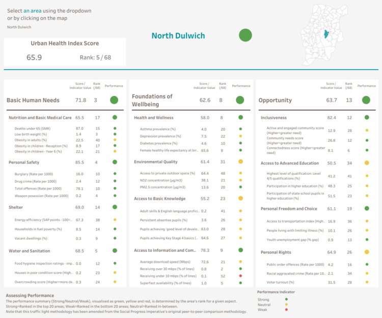
While a change over time analysis in not possible for the UHI as a whole we can see that the neighbourhoods of ‘Herne Hill and Dulwich Park’ and ‘Brixton North’ continue to be the neighbourhoods that experience the best and worst social and environmental outcomes respectively according to their ranking in the index. Although not geographically very far apart, they have very different levels of needs. Brixton North ranks 68/68 and it is in the bottom quintile for most of the underlying measures, Herne Hill ranks 1/68 and it is in the bottom quintile for just a handful of measures.
The updated UHI can be accessed via interactive scorecards.
The look and feel of the new scorecard has been refreshed to take into account users’ feedback.
The new scorecard still shows the UHI score for the area selected, the scores for combined measures (e.g. Basic Human Needs) that form the pillars of the index and each indicator used to build these measures. A “traffic light system” is still used to show whether the area selected is in the top or bottom quintile for each measure, and a map is still featured to allow user to view where the selected area is and how it ranks in relation to other areas in the boroughs.
In the new scorecard the user has now the option to view a chart for each indicator that show the distribution of its values. It was felt that while it is useful to see how each area ranks in relation to the others, it is also important to see if areas are outliers and differ significantly.
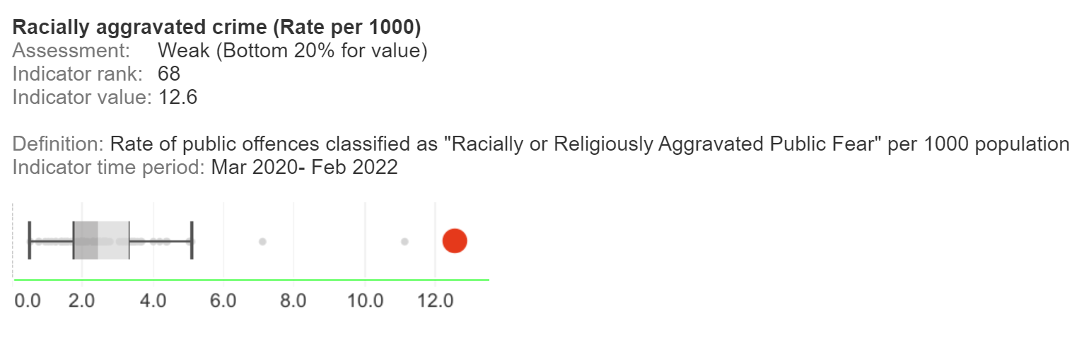
For example, Brixton North has the highest rate of Racially aggravated Crime in the boroughs, ranking 68/68, and this rate is over twice that of the neighbouring area of Herne Hill East, which ranks very closely at 65/68.
The first UHI was calculated for ‘Middle Layer Super Output Areas’ (MSOAs*) in Lambeth and Southwark. With the update of this, we also calculated an Index for Wards and made it accessible by its own interactive scorecard. Organisations we work with use ward level measures to plan interventions and creating an Index at this geographical level can help us and them understand areas which are also more familiar to other stakeholders and to residents.
The ward level scorecard of the Index tells us that the majority of areas in the bottom quintile cluster together. They are all experiencing low level of “Urban health”. As we explore the scorecard for each ward individually we can identify what their highest needs are.
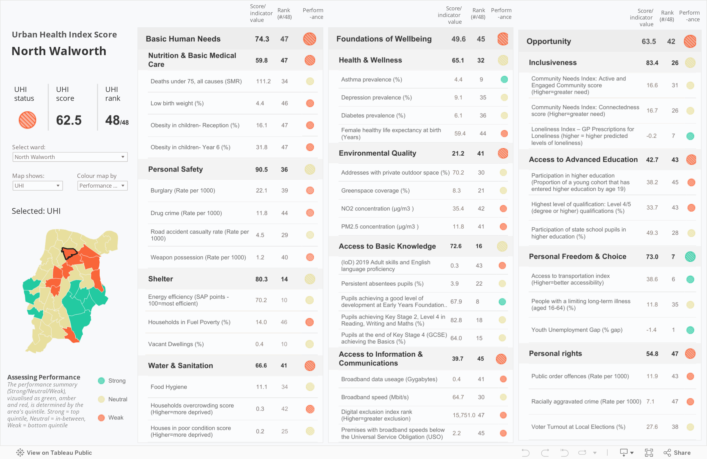
North Walworth is the ward with the lowest UHI score, ranking 48/48. Higher levels of children obesity, fuel poverty, drug crime and overcrowding are just some of the needs that make the overall “urban health” of the area a concern of our programmes.
The UHI can help us understand the needs of neighbourhoods in L&S and where our project can make a greater impact.
We’re currently using the latest iteration of the UHI in our collaboration with Ramboll. The innovative partnership seeks to explore heat inequality in Southwark as cities try to adapt to climate change and address heat related health vulnerabilities. We’ve overlayed the index with climate vulnerability data to identify areas that are particularly vulnerable from both a climate and a health perspective. We’ll then be simulating potential interventions in these areas to identify the most effective ways to mitigate the harm that rising temperatures can have for a city’s residents.
*Middle layer Super Output Areas (MSOAs) are geographical areas .They comprise between 2,000 and 6,000 households and have a usually resident population between 5,000 and 15,000 persons. MSOAs fit within local authorities.
Urban health
With the Social Progress Imperative, we've developed the first neighbourhood level, health-focused social progress index of its kind.
Children's health and food
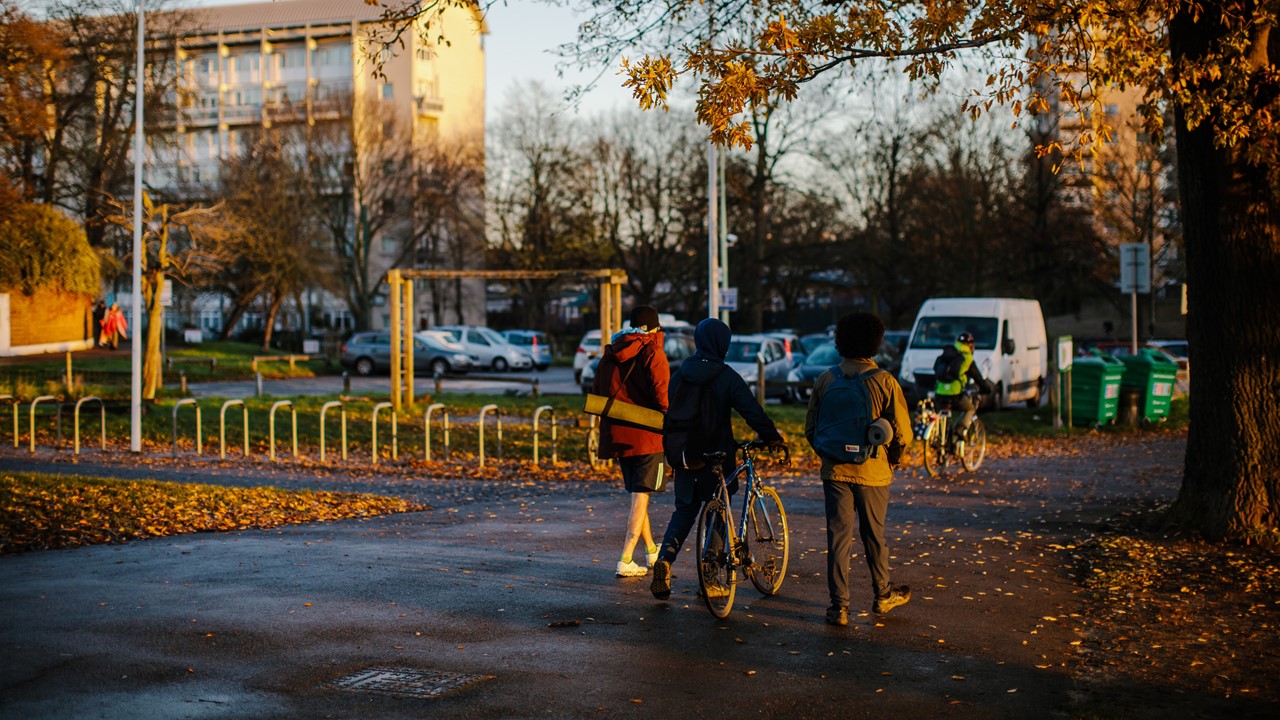
Our new tool shows how a schoolchild's commute to and from school is a prime example of how where we live, play and go to school shapes our health.
Data and analytics
Our data team investigate what the 2021 census reveals about Lambeth and Southwark.